iSport360
Creating a new product experience for a truly unique youth sports platform.
UX STRATEGY | UX RESEARCH | UX/UI DESIGN & DEVELOPMENT
About iSport 360
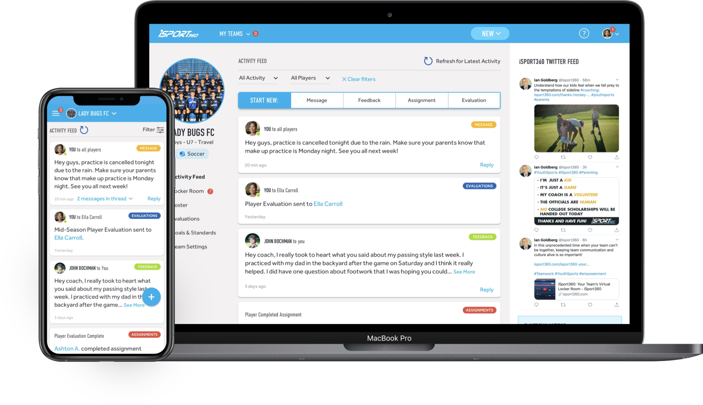
iSport360 is a digital platform for youth sports, focused on creating a positive athletic culture by standardizing coach evaluation strategies and encouraging communication between sport participants. Leading up to the 2020 fall sports season, Urban Emu conducted a UX overhaul of the iSport360 product and website, designing new experiences for four unique user types.
The Challenge
When iSport360 approached us, their product already had over 16,000 active users. The hybrid product contains interfaces for four separate user groups within the platform: coaches, players, parents and administrators. As the development of the original platform progressed, the information architecture grew unwieldy and inconsistencies developed between the unique user views. As a result, important features became buried and confusing, hindering the product’s growth to include better and more useful features. Additionally, a truncated development timeline to accommodate a launch for the impending sports season condensed our design workflow into four short sprints within which we’d need to fully redesign the product.
The Strategy
In addition to cleaning up the information architecture and refreshing the visual interface, our objective was to implement compulsion loops that would increase engagement, giving users more active prompts and calls to action. In an effort to drive conversion, we sought to create a better sign up and onboarding system, providing a clearer and more educational entryway to the product. Design thinking exercises helped us drill down to the core of each unique user group and determine their needs.
The Process
UX approach based on the project needs and business goals
Empathize | Heuristic Evaluation of Existing Experience | Establish Engagement Model/UX Strategy | Information Architecture | Wireframing/Prototyping | UI Design

1. ESTABLISHING EMPATHY
iSport360 had spent the previous sports season collecting user input from their existing base.
Our UX team analyzed this research, with the aim of creating a more action-oriented user experience to drive efficiency and aid communication between the four user groups.
Upon examination of the groups, we determined that the coach experience would be our most effective point of focus to drive the redesign, as coaches could perform the most tasks within the product, and drove engagement from all the other user types. Once the coach experience was redesigned, the other three user groups interfaces would be refreshed following the same principles, but tailored to meet the unique needs of those groups.
2. HEURISTIC EVALUATION
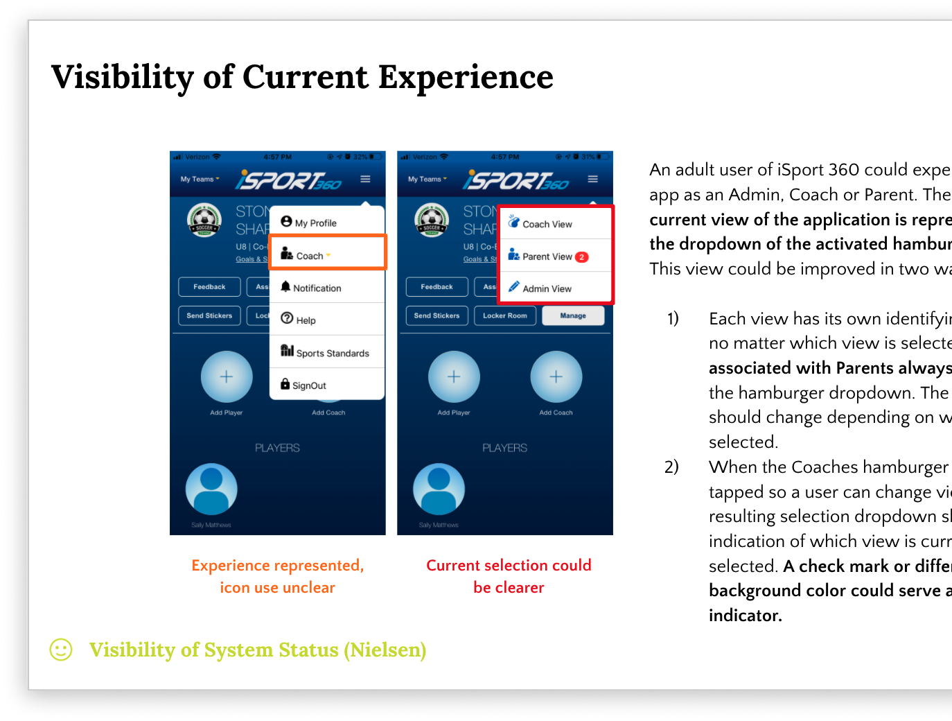
Meanwhile, we conducted a heuristic evaluation of the existing product, focusing mainly on identifying areas of improvement within the coach experience.
The evaluation helped us identify critical pain points in the current user experience. We determined that we would focus primarily on improving consistency and standards and the aesthetic and minimalist design in the product’s UX overhaul.
3. ENGAGEMENT MODEL
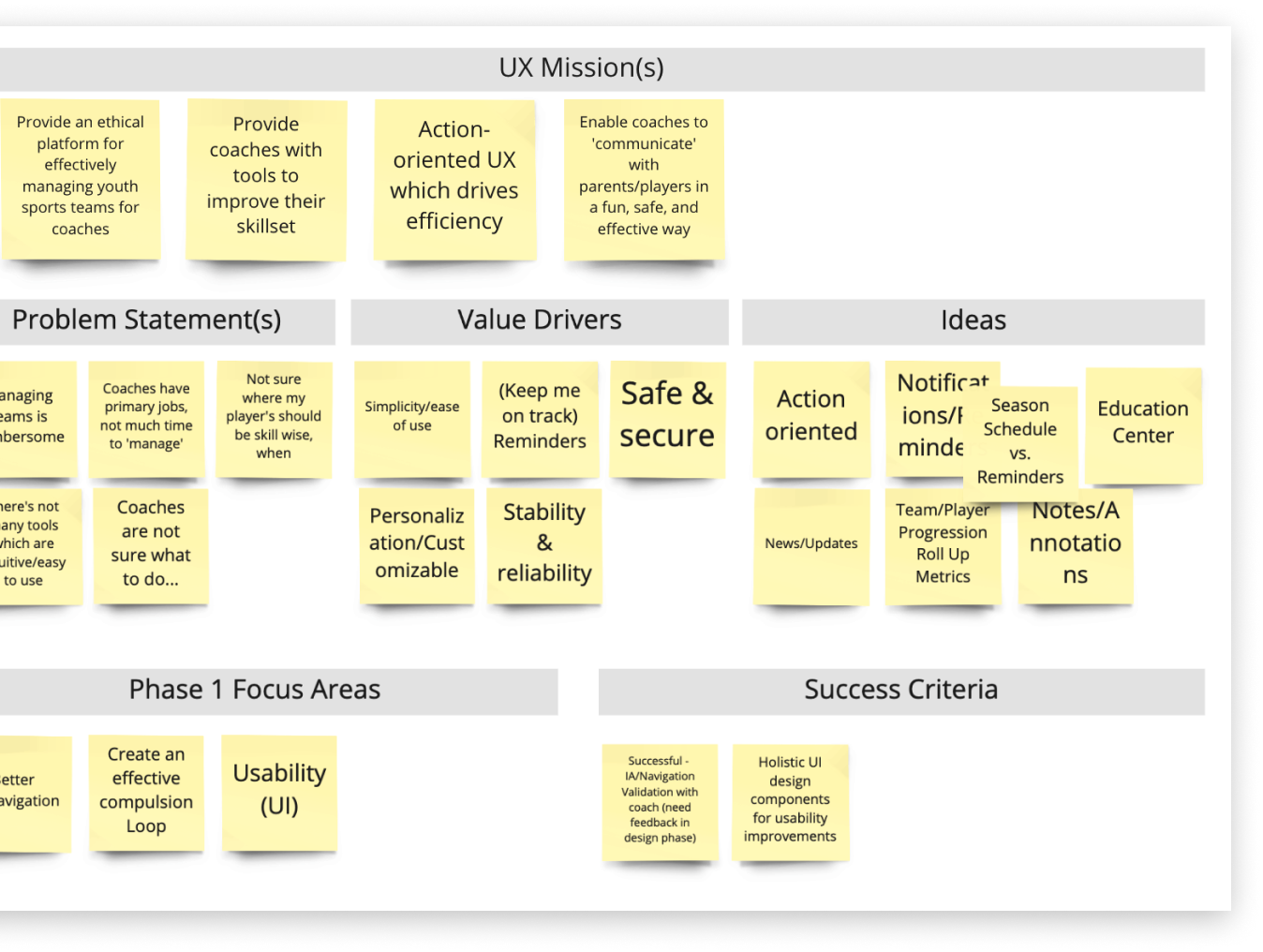
iSport’s original product was lacking the stickiness and engagement model it needed.
Maximizing the value of it’s features hinged on driving regular usage for longer-term periods, so we worked with stakeholders to envision a new communication-driven approach to the entire experience. One of the real problems iSport360 solves is secure communication to your team and all connected people (parents, coaches, etc), and the core of the new user experience was focused around it.
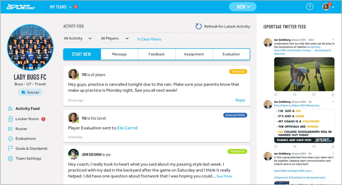
We put literal emphasis on what we called the Activity Feed, making it the default screen when entering the app or web version of the product. The activity feed acted as a hub to all core features and interactions of the entire product while making it personalized to the end-user.
4. INFORMATION ARCHITECTURE
An audit of the information architecture helped us understand where content objects lived in the current product, giving us an idea of any redundancies or dead ends within each user group, and better illustrating each user group’s relationship with the others through the tasks that could be performed.
This audit confirmed the need for a more action-oriented engagement model. Where the original design felt static and one-sided, we wanted our updated design to mimic the energy of a real life sports team interaction. Our solution to this was to turn the iSport360 homepage into an activity feed, where coaches could view an up-to-date log of player, parent and coach activity, as well as iSport360 original content.
We also took an inventory of content objects and relationships, analyzing how different user groups interact with key content within the product, and with each other.
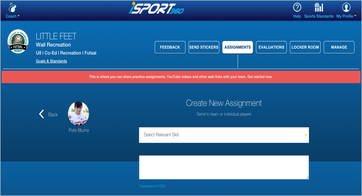
Previous Navigation Structure
Wide and deep, with a lack of hierarchy and sensible connection between pages and features.

New Navigation Structure
Focused on the communication model, we created a hub and spoke model from the activity feed to adjacent/related functions. This allowed features which were horizontally available and relevant across pages to be accessible in a sensible way.

5. WIREFRAMING AND PROTOTYPING
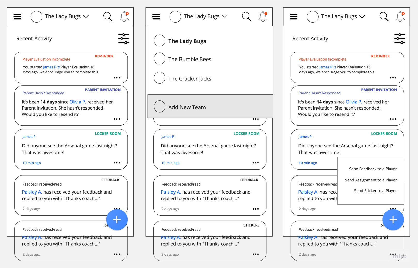
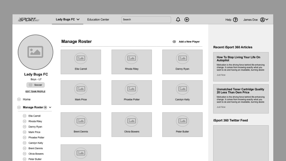
Iterating through several rounds of low-fidelity wireframes, we focused not only on perfecting the new activity feed, but also designing a new navigation model. We chose to defragment the overall navigation pattern to be more circular and intuitive based on a persona mental model, binding the navigation experience around player engagement inside a team ‘hub’ and the platform’s highest value-drivers. We broke the navigation into two zones—a main horizontal nav for overarching platform features, and a left hand team level nav for more specific, team-driven actions.
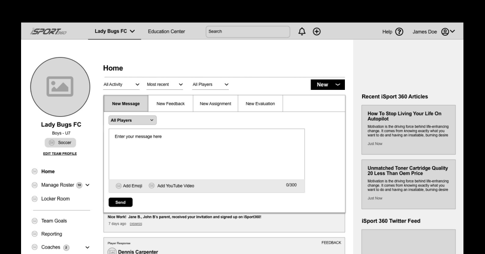
iSport360 had identified bottlenecks in their previous onboarding process, so we spent time overhauling the onboarding to both facilitate quick and easy setup, while also driving feature engagement and awareness. We did this by consolidating and modifying the order of steps based on the personal mental model, adding ease to the initial setup, and including an overview video for added user education.
Although the majority of iSport360 users accessed the product on desktop, the iSport360 team wanted to drive more users to the mobile app with this product update. Thus, we wireframed the updated desktop and mobile products concurrently, making design considerations for busy coaches using the app while on the field or court. The inclusion of a floating action button on mobile would facilitate the quick initiation of a player evaluation or the addition of a team member or coach.
Through our iteration process, we made careful considerations of what was realistic to complete within this development cycle. As a result, certain planned features including search functionality, an education center, evaluation prompts based on seasonal timing, and a certain aspects of the engagement model were de-prioritized and saved for a future development cycle.
6. UI DESIGN
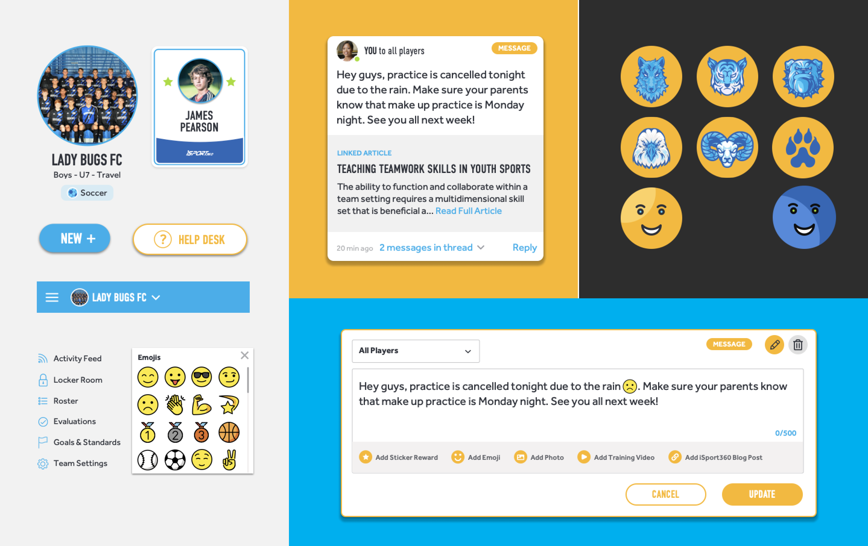
Though we would usually start concepting a user interface later in the process, given the timeline we decided to start UI design in tandem with the low fidelity wireframing, letting stakeholder response drive the visual direction for the product. Between two initial options, one more youthful and one more masculine and sporty, a decision to combine the two directions allowed us to set specific style guidelines that would help us very quickly move from low to high fidelity.
THE FINISHED PRODUCT
A simplified, more pleasing sign-in process reduces friction by helping coaches get their teams set up more quickly.
A video adds optional educational value for users who want to understand more about the product. Clear calls to action help coaches take the next steps to set up their roster, funneling the user to unlock the full potential of the product that comes through adding team members. Tooltips that populate the interface compliment the onboarding and video to help users learn the interface. Our new onboarding design empowers the coach to create his team environment with ease and eliminates the question, “what next?”
The horizontal main navigation allows coaches to navigate between multiple teams, while the left side nav clearly displays the full range of functionality for a single team.
This new navigation structure and action-oriented home screen give users a more informative and engaging entryway into the product than what the old product offered.
Previous navigation
New cross functional navigation
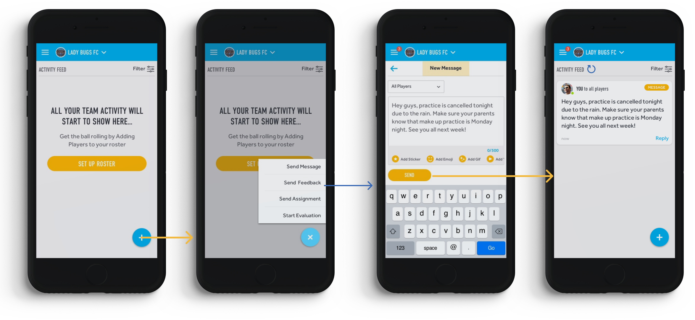
Whereas key actions were fragmented into different buckets in the old product, a centralized “New” button in the updated product ensures all important actions are easily initiated from the same place.
From here, coaches can send their players messages, feedback and assignments, or begin a new player evaluation.
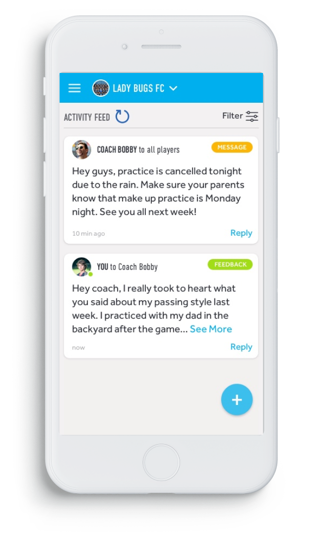
Communications from coaches appear in player’s feeds, where they can respond to messages, complete assignments, or view evaluations.
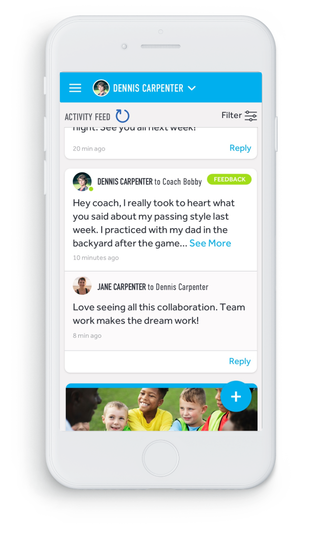
Parents can view player and coach interaction in their own user view, where they also have access to comment.

Communications from coaches appear in player’s feeds, where they can respond to messages, complete assignments, or view evaluations.

Parents can view player and coach interaction in their own user view, where they also have access to comment.
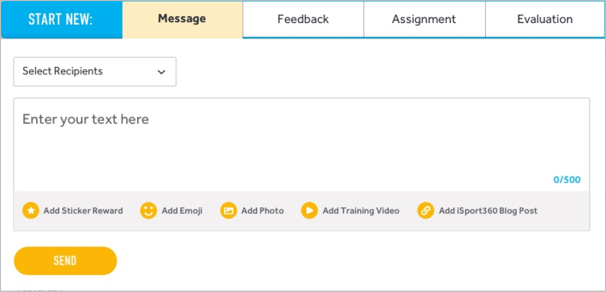
Just as in the mobile version, the desktop product inclues a centralized activity area where the most important actions can be performed: sending messages or feedback, giving assignments, or initiation evaluations. Combining these actions into one module better matches how a user would expect the product communication to work and reduces the effort required to perform each task, freeing up user energy to use the main navigation for more variable tasks.
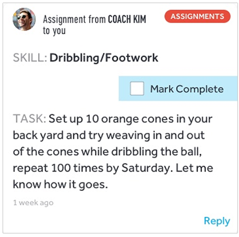
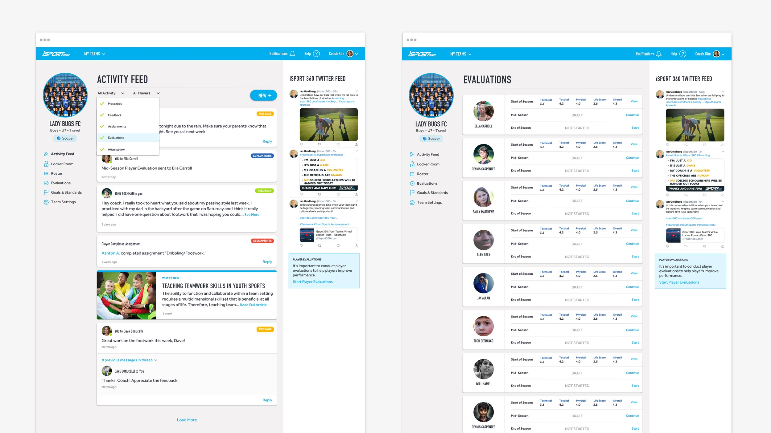
Each category of communication is uniquely labeled in the user’s activity feed, striking a clear distinction between messages, feedback, assignments, and evaluations. The activity feed also features iSport360 blogposts and other brand generated content.
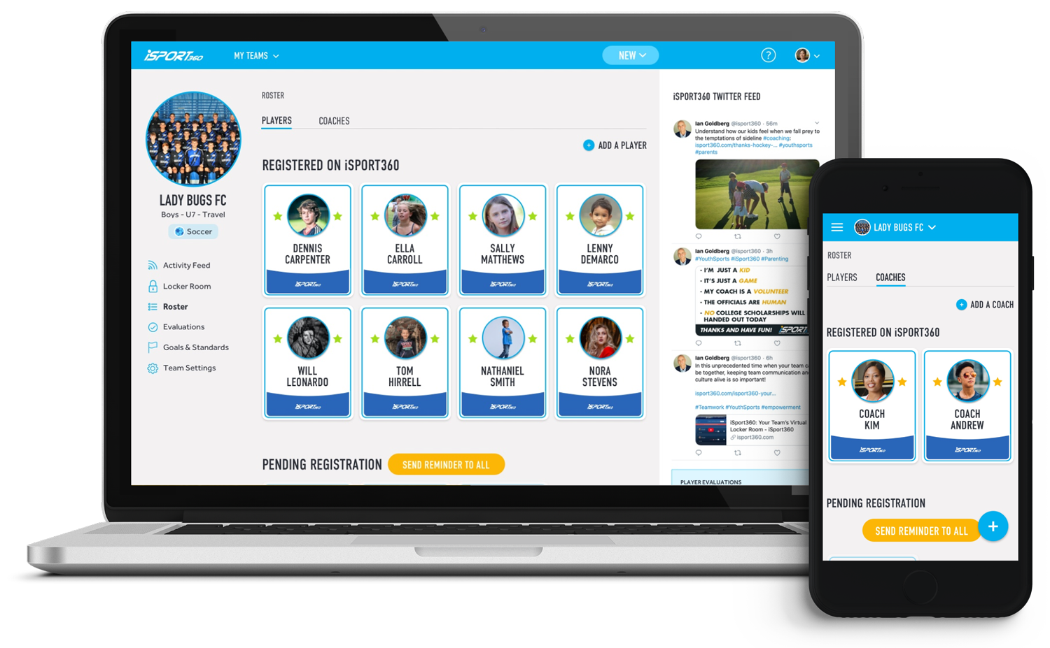
The new Roster screen gives coaches a simple but delightful page for team management, clearly indicating which of their team members have registered with the product, and which team members are still pending registration.
Coaches can add a new player to their roster at any time. Tapping on an individual team member reveals recent activity from that player. Coaches also have the ability to manage their coaching staff within the Roster.
Parents and players have the added benefit of viewing the team roster in their own product views.
Evaluations were the most popular and valuable function carried over from the old product.
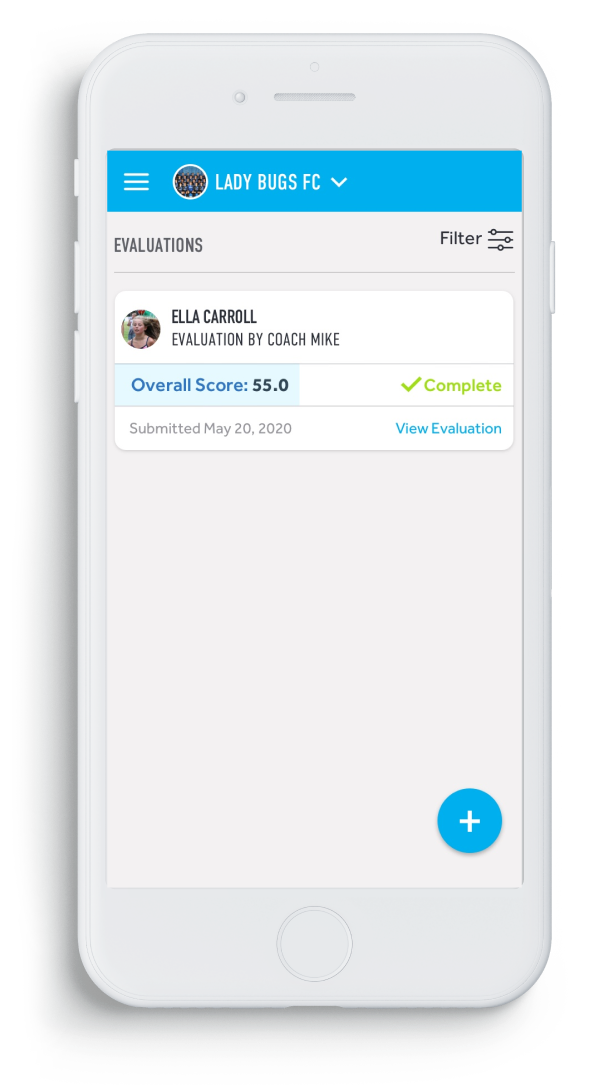
As a result, due to time and development constraints, the functionality of Evaluations was largely maintained, but UI updates added clarity to the assessment process, especially in the organization of completed evaluations. The addition of player images, color coding and completion feedback help show who was evaluated, whether or not the evaluation is complete, and who completed the evaluation.
Coaches can perform evaluations on all team members, where players can view their own coach evaluations, or perform self-evaluations. Parents can also view their players’ evaluations.
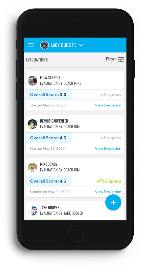
Coach sees all evaluations on the evaluations home screen
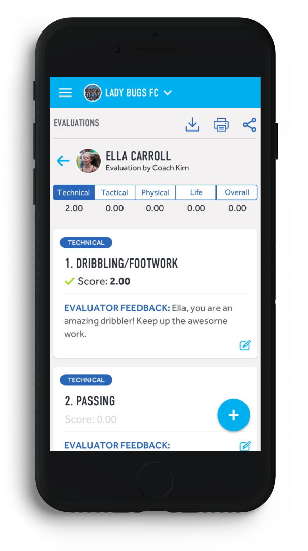
Individual player evaluations are split into four categories and an overall score
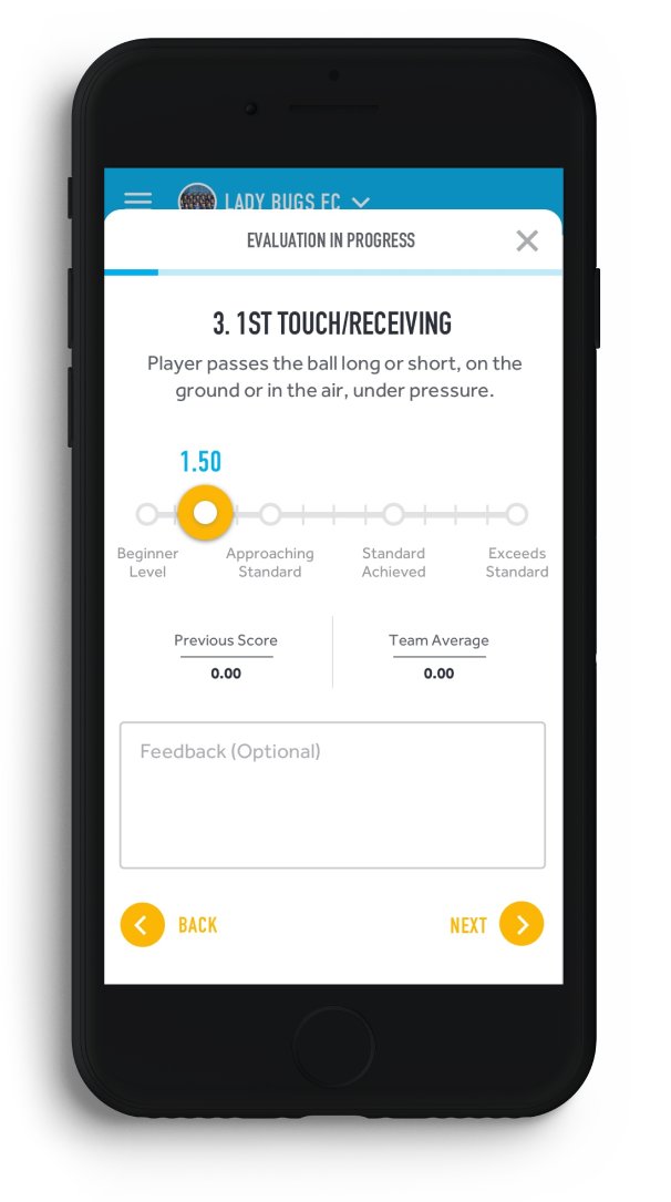
Coach moves through categories within the evaluations wizard
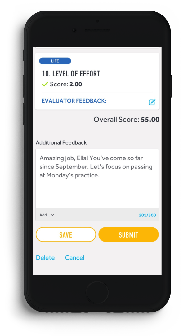
Coach can add closing feedback before submitting for player review
Player can view coach’s evaluation in their own product view
The Outcome
Despite the truncated timeframe, we were able to accommodate the development handoff deadline, working hand in hand with the dev team to complete internal validation and quality assurance. Though the fall, 2020 sports season was impacted by the Covid-19 Pandemic, iSport360 has seen continued success with the redesigned version of their product through higher conversion rates, increased subscriptions and fewer questions from users.
“Urban Emu’s work was exceptional.”
“The team delivered on time and on budget, and the app was redesigned as desired. Customers can expect an efficient and friendly team that keeps their projects on track…Feedback has been outstanding, especially from customers and prospects who had seen earlier versions.”
—Ian Goldberg – ISPORT360 Founder & CEO
Contact Us
Urban Emu is an experience agency proudly driven by a singular mission: to transform the way humans live. We achieve this through a powerful fusion of design, technology, and communications, creating unparalleled online and offline experiences.
We love to hear about ideas big or small. Please don’t hesitate to get in touch with us regarding your project.
Email: hello@urbanemu.com


